Civ 7's Deluxe Edition debuted recently, and online discussions are already buzzing about its user interface (UI) and other shortcomings. But is the UI truly that flawed? Let's delve into the game's UI elements and assess whether the internet's criticisms are justified.
← Return to Sid Meier's Civilization VII main article
Is Civ 7's UI as Bad as They Say?
Early access players of Civ 7's Deluxe and Founder's Editions are already voicing concerns, particularly regarding the UI (and missing quality-of-life features). Before joining the chorus of criticism, let's objectively evaluate the UI's effectiveness as a 4X game interface. We'll analyze its components to determine if it meets the standards of a good, or at least functional, 4X interface.
Defining a Successful 4X UI
While some argue for objective 4X UI design principles, the reality is more nuanced. A game's context, style, and goals influence UI design, requiring case-by-case assessment. However, visual design principles highlight common elements found in successful 4X UIs. Let's use these principles to evaluate Civ 7's UI.
Clear Information Hierarchy
A clear information hierarchy prioritizes accessibility and importance. Frequently used resources and mechanics should be prominent, while less critical features should be easily accessible. The UI shouldn't display everything simultaneously, but organize information logically.
Against the Storm's building info menus exemplify this. Right-clicking a building reveals a multi-tab menu, prioritizing common actions (worker assignment, production) in the default tab, while less frequent actions are placed in subsequent tabs.
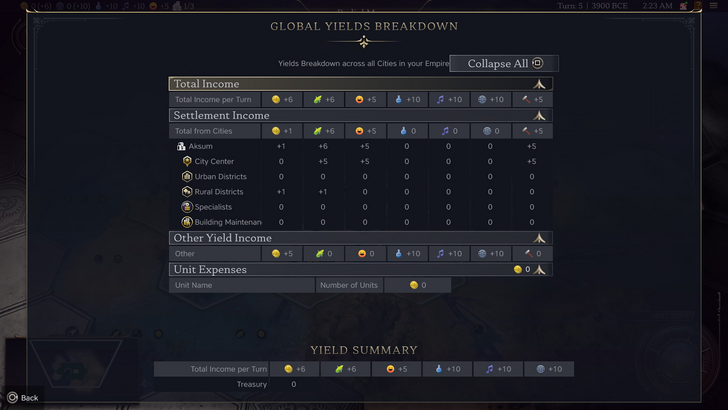
Civ 7's resource summary menu displays resource allocation, separating income, yields, and expenses via dropdowns. The table format is efficient, and the menu collapses easily. However, it lacks granular detail; it shows resource origin from Rural Districts but not specific districts or hexes. Expense breakdowns are also limited. While functional, more detailed information would improve its effectiveness.
Effective and Efficient Visual Indicators
Effective visual indicators (icons, colors, overlays) convey information quickly. A good UI uses visuals to communicate data without extensive text.
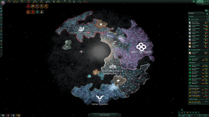
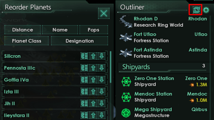
Stellaris' Outliner, despite overall UI criticism, effectively uses visual indicators. Icons instantly show ship status (transit, scanning, etc.), and planet icons indicate colony needs.
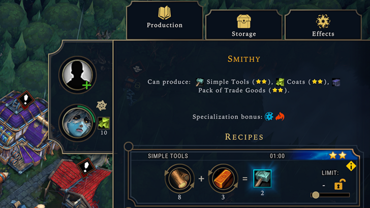
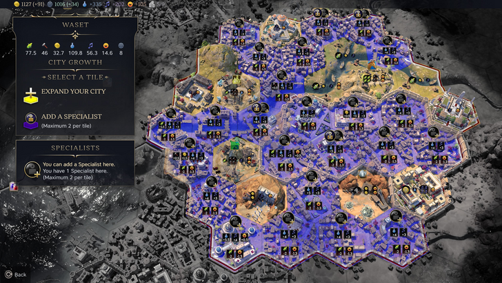
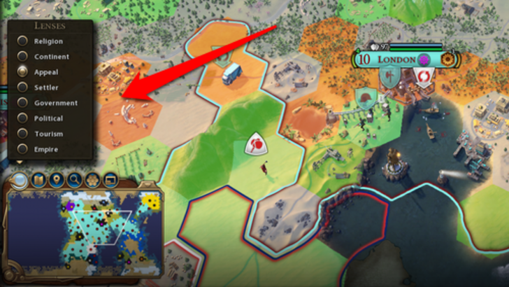
Civ 7 uses iconography and numerical data, but some visual indicators are effective: tile yield overlay, settlement overlay (color-coded hex viability), and settlement expansion screen (rural/urban distinctions). The absence of certain Civ 6 lenses (appeal, tourism, loyalty) and customizable map pins is a common complaint. While not terrible, improvement is possible.
Searching, Filtering, and Sorting Options
As complexity increases, search, filtering, and sorting become crucial. Search bars, filters, and sort buttons streamline navigation.
Civ 6's powerful search function allows for easy location of resources, units, etc., and its Civilopedia links seamlessly to in-game elements.
Civ 7 lacks this crucial search function, a significant usability drawback. Its absence negatively impacts navigation, and its addition is highly desirable.
Design and Visual Consistency
UI aesthetics and cohesiveness are vital. A poor UI detracts from the overall experience.
Civ 6's dynamic, cartographic style seamlessly integrates with the game's aesthetic.
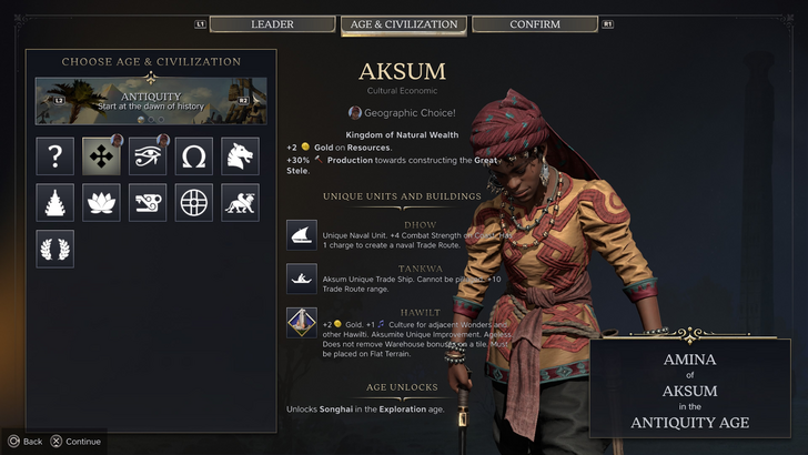
Civ 7 adopts a minimalist, sleek design, using black and gold. While not cheap-looking, its subtler thematic approach leads to mixed reactions. Visual design is subjective, but the lack of immediate clarity is a point of contention.
Conclusion: Not the Worst, But Room for Improvement
Civ 7's UI, while not ideal, isn't as disastrous as some claim. The missing search function is a significant flaw, but not game-breaking. Compared to other issues, it's relatively minor. While visually less striking than some competitors, it possesses strengths. With updates and player feedback, it can improve. Currently, the criticism seems overly harsh.
← Return to Sid Meier's Civilization VII main article
Sid Meier's Civilization VII Similar Games